Tulip Bouquet Color Theory: Palette Guide
Tulip Bouquet Color Theory Foundations for Stunning Arrangements
In the world of floral design, color is the compass that guides mood, tone, and memory. When you explore tulip bouquet color, you unlock palettes that range from crisp whites and sunny yellows to velvety purples and tropical pinks. This guide establishes the foundations that help you craft arrangements with balance, contrast, and seasonal resonance, whether you’re styling a tablescape, a wedding centerpiece, or a seasonal display for BloomHaven.com. By unpacking color relationships, temperature, light, and proportion, you’ll gain a robust framework to deploy tulips with confidence in 2026 and beyond. Each concept builds toward practical palettes you can apply across occasions, venues, and budgets. The aim is not to memorize rules but to develop intuition: you’ll be able to respond to a room’s light, a venue’s architecture, and a client’s story with a color plan that feels intentional, not accidental. Throughout, you’ll see how small shifts in hue, value, or saturation can transform a simple bouquet into a narrative centerpiece. Ready to dive in? Let’s start with the core concepts that underlie every successful tulip arrangement.
Tulip Bouquet Color Foundations: Core Concepts
At the core of the tulip bouquet color system are three ideas: relationships, contrast, and mood. The tulip bouquet color is not a single note but a chord that emerges when you pair hues with intent. Think of the color wheel as a map that reveals harmonies and tensions within the tulip spectrum. Therefore, you can forecast how a white tulip with a blush pink companion will feel versus a saturated red paired with a lime green accent. By mastering core concepts, you’ll know which colors to combine and which to separate. In practice, you’ll translate mood into palettes: softness for romance, vibrancy for celebration, and serenity for minimalism. Additionally, consider context—light, venue, and season—as you judge what a given tulip bouquet color combination communicates. As you read ahead, you’ll see how these relationships extend to arrangements that hold up under real-world constraints like vase height, stem length, and bloom timing. The goal is clarity: a well-structured color foundation supports creativity rather than suppresses it.
The Color Wheel and Tulip Color Choices
The color wheel is a practical tool for tulip bouquet color planning. In practice, you’ll map tulip color choices on the wheel to forecast relationships at a glance. For the tulip bouquet color, consider primary pairings like complementary red and lime, or analogous pink and peach tones. Use this map to choose dominant tulip colors and supporting varieties that stay within one or two families for cohesion. In addition, remember that tulips bloom in varied intensities; therefore, a gentle primary hue can be enriched with a deeper secondary shade to avoid flatness. When you design, start with a dominant color and then select two accents that support, rather than dominate, the scene. Finally, test your palette in a mock arrangement to see if the colors read as you intend under the venue’s lighting.
For a concise primer on color theory, see color theory.
Harmony vs. Contrast: Building Blocks for Tulip Arrangements
Crucially, harmony means the tulip bouquet color families repeat or echo across stems; contrast creates focal points. Therefore, plan for a central tulip color with sprouts of a contrasting neighbor to direct the eye without overwhelming the senses. In addition, the choice of bloom shapes and foliage can influence perceived color, because petal structure and greenery add texture that shifts the apparent hue. The aim is to create a story with progression, not a random splash of color. In practice, use one dominant hue and two supporting accents within the tulip bouquet color vocabulary. This balance translates to tablescapes where a white parrot tulip or a bright yellow lily-flowered cultivar forms the anchor, while a few red-tipped varieties provide those subtle sparks.
Temperature and Mood in Tulip Bouquet Color
Temperature is a shorthand for mood. Warm tulip bouquet color—blush, coral, apricot—evokes warmth and sociability; cool tones—lavender, blue-tinged purples—feel calm and refined. In addition, mixed temperatures can energize a centerpiece, while a single-temperature palette exudes elegance. Crucially, consider where the arrangement will live: a bright room creates more contrast for warm colors, while a shaded corner softens them. By blending temperature thoughtfully, you create a path from first glance to lingered admiration. Therefore, think of warm and cool as a dialogue, not a rule, that you negotiate with your choice of tulip varieties and complementary greens.
Light, Space, and Proportion: How Tulips Occupy a Palette
Lighting determines perceived tulip bouquet color more than any other factor. In daylight, colors read bright and clean; under candlelight, pinks soften and yellows glow. Therefore, plan with lighting in mind: position tall stems at the back of a arrangement to avoid color clashes; use a narrow vase to compress space for a focused tulip bouquet color moment; or open a larger container to create air and breath for lighter colors. The space around the arrangement also affects perception. A densely packed display can intensify color, while an airy setup lets individual blooms breathe and reveal their subtleties. Finally, consider the vase color as a frame: a white vase will make pastels pop, while a dark container will deepen drama. In all cases, your goal is to let the tulip bouquet color truth shine without being overwhelmed by surroundings.
Color Palettes for Tulip Bouquets: Practical Schemes
With the theory in place, you can translate knowledge into tangible palettes for real-world styling. The tulip bouquet color becomes a set of anchors you can reuse, season after season. Here are three practical palettes that illustrate how to apply foundations to different contexts: Analogous, Complementary, and Monochromatic Variations. Each scheme uses tulips in dominant and supporting roles to create a distinct mood and flow.
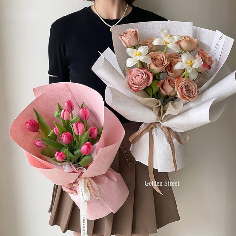
Analogous Schemes for Soft Spring Look
Analogous tulip bouquet color runs along one side of the color wheel; this creates a gentle, cohesive look ideal for spring tables and intimate ceremonies. Use tulips in soft pinks, peach, and cream with a hint of pale yellow to maintain brightness without compromising harmony. In this tulip bouquet color approach, repetition matters more than bold contrasts; the result feels like a watercolor wash that invites conversation rather than competition. This approach embraces tulip bouquet color as a cohesive language that softly guides the eye from bloom to bloom.
Complementary Schemes for Bold Statements
For dramatic tulip bouquet color, pair a vivid tulip with its opposite on the color wheel—think bright magenta against lime green, or saturated apricot against cool lilac. These combinations trigger high contrast and visual energy. Balanced with a neutral anchor, this tulip bouquet color approach can anchor a wedding centerpiece or storefront display. To keep the composition from vibrating, limit the number of high-saturation blooms and soften with white or gray foliage. The tulip bouquet color becomes a statement a room remembers.
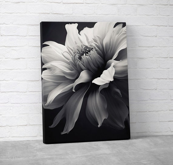
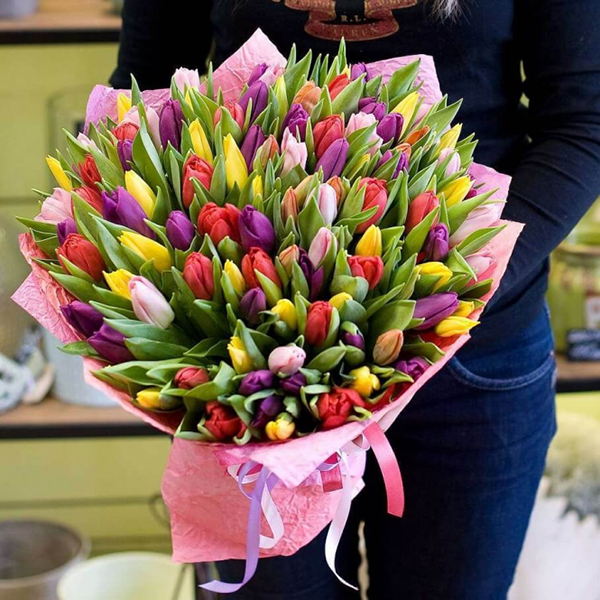
Monochromatic and Tonal Variations with Tulips
Monochrome schemes explore variations within a single hue. A tulip bouquet color that runs from pale blush to tomato red remains cohesive while offering depth. Use texture and form to avoid flatness; include different tulip varieties (peony-flowered, Darwin, fringed) to add interest while preserving color unity. This tulip bouquet color approach is especially effective in minimalist settings, where restraint elevates detail.
Seasonal Context: Tulips Through the Year
Although tulips are emblematic of spring, color planning for tulips extends beyond their peak bloom. The tulip bouquet color can be manipulated by pairing with seasonal greens, berries, or other flowers to create year-round interest. In spring, bright, fresh scales dominate; in late spring, deeper tones become more appropriate; in early summer, soft pastels can bridge into the warmer months. By tracking these shifts you ensure that your tulip bouquet color remains relevant in blog posts, photo shoots, and client briefs.
Spring Bloom Trends and Color Timing
In 2026, BloomHaven readers favor soft corals, lemony yellows, and misty taupes as a base for tulip bouquet color palettes. Timing your color release around market availability matters: which tulip varieties are in season influences the overall palette and the confidence of the arrangement. The tulip bouquet color choices you deploy should align with seasonal cues to maximize impact. Additionally, test combinations under typical venue lighting to protect hue fidelity during setup.
Wedding and Event Palettes: Deploying Tulip Colors
For weddings and events, you’ll often design with a color story rather than a single hue. The tulip bouquet color evolves through line, focal petals, and accents such as greenery or complementary but non-floral textures. In the context of a ceremony backdrop or a terrace dining table, use your palette to create a cohesive environment while allowing individual blooms to shine. Therefore, storytelling through color matters as much as form, and you should plan palette progressions across bouquets, centerpieces, and installation pieces to maintain unity.
Sourcing and Material Pairings: Beyond the Tulip
Beyond the tulip itself, color comes alive when you pair tulips with foliage, berries, grasses, and even ceramic vessels. The tulip bouquet color reads differently when framed by dark greens or by airy whites. In addition, consider vase material and lighting to preserve the intended hues. For example, glass or crystal can intensify reflections, while matte ceramics soften color perception. Finally, incorporate sustainable sourcing practices: choose locally grown tulips when possible to reduce transport color fatigue and ensure freshness that sustains vibrancy in tulip bouquet color.
Next, in Part 2: Palette Pairings and Practical Arrangements, we translate these foundations into actionable palettes and step-by-step setup guides for real-world scenarios.
Apply Tulip Bouquet Color Theory: Step-by-Step Palette Selection for Real-World Arrangements
Translating color theory into everyday arrangements begins with a plan. The tulip bouquet color you choose will influence every other element: greens, fillers, even the vase. In this section we break down a practical, step-by-step palette selection process you can apply to any real-world event or home display. Each step keeps the tulip bouquet color at the center, ensuring cohesion from first glance to last impression.
Step 1 — Clarify the mood, occasion, and season
Start with the mood you want to convey. Is the event romantic, modern, garden-fresh, or rustic? The tulip bouquet color should reflect that mood. Consider the season and venue lighting, both indoors and outdoors. The choice of tulip bouquet color sets expectations for the rest of the palette. Specifically, warm tones convey intimacy, while cool tones bring a calm, airy feel. Use concise language and quick checks to guide your decisions. In a real-world setting, the mood informs color decisions, not the other way around.
Think about the audience and purpose as well. A wedding demands soft, cohesive romance; a corporate event might require clarity and a hint of polish. The tulip bouquet color you select should be legible from a distance yet inviting up close. If you capture the right mood in the first glance, the entire display has flow and purpose.
Step 2 — Establish base colors: core tulip colors and base hues
Choose 2–3 core tulip colors that anchor the bouquet. For example, a soft blush pink, a creamy ivory, and a statement coral can form a balanced base. The tulip bouquet color you choose becomes the frame for the entire arrangement. Use these core colors across stems, greenery, and textures to create cohesion. In practice, you want a dominant hue, a supporting hue, and a highlight hue. When you limit base colors, you reduce chaos and improve recognition from across the room.
Consider the light in the display area. A bright window may intensify pinks and corals, while a shaded corner softens them. If you expect mixed lighting, lean toward colors that maintain integrity in both scenarios. This deliberate base helps the tulip bouquet color live confidently in real-world environments.
The tulip bouquet color is not just about petals. It’s about how those petals respond to mirror surfaces, glass, and greenery. The base colors set the stage for the entire color drama you will stage later in the arrangement.
Step 3 — Build harmony: color schemes for tulip bouquets
Color harmony guides how you connect core colors. The tulip bouquet color will behave differently in analogous, complementary, triadic, and neutral schemes. In an analogous scheme, pick colors adjacent on the color wheel for soft transitions. A complementary approach adds contrast by pairing tulips of opposite tones. A triadic palette uses three evenly spaced colors for a lively yet balanced look. Neutral tones like whites, creams, and soft greens help anchor brighter tulip bouquet color choices.
Analogous palettes create gentle progressions and harmony. If you choose a pink-to-peach-to-coral spectrum, the tulip bouquet color reads as a natural continuum. This approach is especially effective in intimate settings, such as a small dining table or a ceremonial altar, where too much contrast can feel discordant. In contrast, complementary schemes heighten drama and visibility. Pair a vivid tulip bouquet color with a contrasting hue to draw the eye to focal points like centerpieces or ceremony arches. A triadic scheme introduces a playful energy without overwhelming viewers, while neutrals provide breathing space that keeps the composition readable at a distance.
Analogous palettes for soft transitions
Analogous palettes create gentle progressions that feel organic. When you select tulip colors that sit beside each other, the bouquet communicates calm and cohesion. For instance, pink, peach, and coral tulips blend smoothly, with subtle shifts in tone that read as a single color family. The tulip bouquet color relationships stay harmonious in space and light. Use foliage to support these hues rather than overpower them. Specifically, eucalyptus, ruscus, or olive branches can extend the color narrative and add subtle texture that echoes the greens behind the blooms.
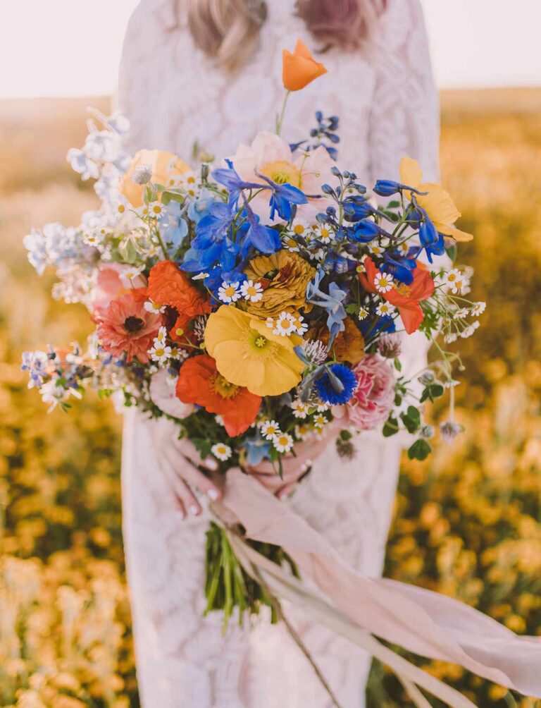
Complementary and triadic for contrast
For a dynamic look, pair tulips with colors on the opposite side of the wheel. A bold combination could be purple tulips with yellow accents, or red tulips with lime-green foliage. In a triadic scheme, select three colors evenly spaced on the wheel—think pink, lavender, and mint—for a lively, balanced feel. The tulip bouquet color remains vibrant without becoming chaotic when you balance intensities and proportions. Use white or ivory as a cooling anchor to prevent overload and to give each hue room to breathe.
Neutral accents to temper the color story
Neutral tones anchored by greens, whites, and soft taupes act as relief for strong tulip bouquet color. Neutrals let the tulips stand out with dignity. Use them in vase choices, fillers, or ribbons. The tulip bouquet color remains the hero, while neutrals provide breathing space for the eye. In practical terms, a neutral backdrop is your best friend for high-contrast palettes. Neutrals also give you flexibility when lighting shifts during an event, ensuring the palette remains legible and elegant.
Step 4 — Add neutrals and greenery for depth
Beyond tulips, greenery adds texture and depth. Choose foliage with different shapes: broad leaves for mass, feathery textures for lightness, and sturdy stems for structure. The tulip bouquet color reads more elegantly when greens are varied but cohesive. Use a mix of eucalyptus, aspidistra, or ruscus to create layers and movement. The goal is depth, not clutter. Greenery acts as a bridge between colors and helps the eye travel through the arrangement, guiding attention from focal blooms to supporting stems.
Texture matters. A matte finish on some leaves contrasts with the gloss of tulip petals, enriching perceived color. You can also introduce dried elements lightly to echo the palette without stealing focus from the tulips. The careful balance of foliage keeps the tulip bouquet color expressive rather than loud.
Step 5 — Manage lighting, vase, and arrangement constraints
Lighting changes how color is perceived. A bright sunny room makes tulip bouquet color pop; candlelit tables soften it. Always plan for the primary viewing angle and the most common lighting scenario. Consider the vase shape and height in relation to color distribution. A tall cylinder vase may highlight vertical spikes of color; a low, wide bowl invites a broad, low spread that shifts the color balance. The tulip bouquet color should be planned with these physical constraints in mind so the palette reads correctly from the front and from the sides.
Vase material also influences perception. A glass vase may reflect and amplify color, while a ceramic or metal container can mute or guide the overall vibe. If you anticipate multiple event spaces or photo setups, draft color maps for each scenario. In practice, a small adjustment in container color can enhance the tulip bouquet color dramatically without changing the blooms themselves.
Step 6 — A practical workflow: from vision to vase
Begin with a mood board that includes images, fabric swatches, and color chips. Translate those into a master list of tulip varieties by color, plus compatible greenery. Map stem quantities to ensure the tulip bouquet color is proportional and harmonious. Assemble a test bouquet and photograph from multiple angles. Review the photos under the lighting you expect for the event, and adjust ratios to correct any imbalances. Finally, share care instructions with the florist, noting that tulips can continue to open and shift color slightly after cutting.
The workflow should be repeatable. Create a simple template that captures base colors, chosen harmony scheme, greenery mix, and vase type. When you reuse this template, you’ll accelerate future palettes while maintaining a consistent brand voice for your Tulip Bouquet Color guides.
Quick tips for monochrome versus mixed tulip bouquet color
Monochrome palettes use only one tulip bouquet color with varying tones of the same hue. They read elegant, serene, and timeless. Mixed palettes layer distinct colors while maintaining balance through proportion and light. In both cases, consider the optical weight of each color. Use darker shades sparingly to avoid heavy, crowded looks. The tulip bouquet color can be bold, but restraint keeps it refined and readable at arm’s length and up close.
Occasion-focused adjustments: weddings, events, and home display
Weddings benefit from romance in the tulip bouquet color, with soft pastels and ivory tones. Corporate events call for sharper, cleaner contrasts to read from a distance. Home displays favor approachable palettes with consistent lighting and everyday freshness. Tailor the tulip bouquet color to the audience, venue, and lighting to maximize impact without overwhelming the space.
For ongoing inspiration and practical notes on color usage, you can explore expert guidance on tulips and color theory from a trusted horticultural resource. The Royal Horticultural Society’s tulips page offers cultivar ideas, color context, and care tips that complement palette decisions. Tulips on the RHS provides a robust reference as you refine your tulip bouquet color strategy.
By the end of this section you should feel confident translating a careful tulip bouquet color into a real-world arrangement that sings in the room. The approach scales from a single vase to a full tablescape or foyer display. You’ll build palettes that are both practical and photogenic, aligning with BloomHaven’s aesthetic and 2026 color trends.
In Part 3, titled “From Palette to Vase: Real-World Floral Design Techniques,” we will translate this palette theory into finished arrangements that you can implement for events and photo-ready displays. Stay with us as we move from theory to practice.
Advanced Tulip Color Theory Techniques and Creative Guidance
In this final section, we translate core color theory into actionable, advanced techniques for crafting tulip bouquets that captivate with depth, harmony, and storytelling. The focus is on refined color judgment, texture integration, and presentation choices that elevate a simple tulip bouquet color into a lasting impression. You’ll learn to evaluate color under real-world lighting, stage dynamic palettes for clients or followers, and push your creative boundaries with gradient, monochrome, and texture-forward arrangements. This is where theory meets practice for BloomHaven readers who want expert-level guidance that still reads as approachable inspiration.
To achieve consistent results, apply these techniques across your workflows: selecting stock tulip varieties, designing for visual impact in photos, and communicating mood through seasonal palettes. Expect a blend of practical steps, quick-reference heuristics, and sample schematics you can adapt for weddings, storefronts, or social media showcases. Ultimately, the goal is a tulip bouquet color language that feels intentional, fresh, and uniquely yours.
Refining the Tulip Bouquet Color Palette through Harmonies
Color harmony is the backbone of elegant tulip arrangements. Start by understanding the color wheel, then layer proportion and contrast for a balanced look. In tulips, harmony can be achieved with deliberate schemes that communicate a mood or story. A calming scene benefits from analogous pairs like blush pinks, soft peaches, and creamy whites. A dramatic focal point benefits from complementary clashes such as deep purples with crisp yellows. For playful energy, try triadic combinations that place bold hues at even intervals on the wheel. The real art is knowing when to tilt the balance toward quiet white space or a punchy dash of color.
Practical rule of thumb: aim for 60/30/10 proportions—60% dominant hue, 30% secondary, 10% accent. In tulip bouquets color is most effective when the dominant hue aligns with seasonality. Lights and shadows alter perceived hue, so reassess after photographing or moving to a different room. The tulip bouquet color should feel cohesive at a glance, yet reveal nuance up close.
Analogous and Complementary Paths for the Tulip Bouquet Color
Analogous schemes group tulip colors that sit next to each other on the color wheel. They create serenity and cohesion, ideal for wedding displays or spa-inspired arrangements. Complementary schemes pair color opposites for high-contrast drama, which can read as luxury or editorial flair in photography. When using analogous schemes, include a single contrasting stem or a touch of white to prevent monotony. When employing complementary contrasts, balance is key—softening one side with muted foliage or using a neutral vase to let color do the talking.
Triadic arrangements mix three evenly spaced hues for energy without chaos. In tulip bouquets, a triad might combine a warm coral, a cool lavender, and a balanced ivory. The trick is to regulate saturation: keep one hue dominant, one as an accent, and one as supporting shade. This keeps the tulip bouquet color feeling deliberate, not chaotic.
Applying Color Theory in the Tulip Bouquet Color Context
Begin with a mood map: what emotion should the bouquet convey? Then select a base tulip color that anchors that mood. Layer in an accent hue for depth, and use foliage to modulate brightness and temperature. Consider light direction: north-facing windows soften edges; direct sunlight intensifies saturation. In displays, spotlight the main hue with a second, cooler hue as a counterpoint, and reserve a small amount of a warm highlight to mimic natural sunlight. As you design, tally your color components: hue, value (lightness), and chroma (saturation). A well-balanced tulip bouquet color maintains readability from a distance while rewarding close inspection.
To reinforce discipline, maintain a color inventory sheet. Note each tulip variety’s exact hue and availability across seasons. Track how combinations look in the room where they’ll be used and how they photograph. See how a slight change in a single tulip shifts the overall mood. You’ll gain the ability to iterate quickly and reliably, which is essential for professional clients.
Seasonal and Thematic Tulip Bouquet Color Palettes
The best tulip bouquet color strategies respect seasonality and narrative. Spring palettes lean into new growth and soft pastels, echoing fresh blooms and sunlit mornings. Summer palettes can embrace saturated primaries and clean whites, reflecting long days and vibrant gardens. Autumn palettes move toward warm terracottas, olive greens, and muted golds, echoing harvest tones. Winter palettes favor cool whites, pale blues, and deep greens for a clean, contemplative look. Aligning tulip colors with the season strengthens storytelling and enhances perceived value in photos and displays.
Seasonal palettes also align with venue and client stories. For a garden-inspired wedding, opt for peach, blush, and ivory tulips with trailing greens. For a modern, minimalist showroom, use a monochrome or near-monochrome palette with a single accent color. When designing for a blog post or social feature, narrate the color journey from bud to bloom, highlighting color change and texture as the bouquet opens. This approach keeps the tulip bouquet color compelling across images and posts.
Spring Garden Narratives and the Tulip Bouquet Color Story
Spring narratives hinge on renewal and light. Use soft pinks, creamy whites, and pale yellows to evoke warmth. Introduce a single, slightly bolder color to anchor the story, such as a lavender or peach tulip, and balance with airy greens. The goal is a gentle progression rather than a jarring leap in color. In photographs, shoot near windows with diffused light to preserve the softness of the colors and the delicate texture of petals.
Theme-driven palettes work beautifully for events, storefronts, or seasonal collections. A garden-party palette might include blush pink, apricot, and white with sage or olive accents. A woodland-meets-ballroom palette could blend ivory with mauve and champagne, offset by deep green foliage. Each combination supports the narrative you want to tell with the tulip bouquet color.
Event and Style Alignments
Color choices should align with event style and branding. For a romantic wedding, favor soft, airy hues with minimal saturation. For a fashion-forward shoot, lean into high-contrast pairings and crisp whites. For a storefront display, pick high-visibility color blocks that stand out on social feeds. The tulip bouquet color must serve the story, the lighting, and the camera work that follows.
Texture and Form: Beyond Color
Color deserves context. Texture and form matter as much as hue for a compelling tulip bouquet color. The silhouette of tulips—strong stems, elongated buds, and fluttery petals—interacts with color to create depth. Pair glossy velvety petals with matte foliage, or combine ruffled petals with simpler, linear stems to emphasize color blocks. Consider the contrast of bloom sizes: a cluster of large, cup-shaped tulips against slim, upright stems creates a dynamic rhythm that highlights color shifts rather than masking them.
Foliage serves as a tonal bridge. Eucalyptus, olive, or dusty miller can soften or sharpen a tulip bouquet color by modulating light reflection. Textural variety can also emphasize gradient or monochrome schemes. For monochrome experiments, vary petal shades of the same family and use foliage textures to add depth. In complementary palettes, a touch of dark foliage can anchor the contrast and prevent color overload.
Foliage and Stem Considerations
Choose foliage with cool undertones to mute overly warm tulip colors, or warm-toned greens to boost brightness in pale petals. Consider stem length and bloom stage; stagger blooms to create natural color layering, which enhances perception of tone and depth. When shipping or displaying in a vase, ensure stems are trimmed uniformly and water is clean to preserve color integrity. Small details like vase color and container texture influence how the tulip bouquet color reads in person and on camera.
Texture Pairings with Tulips
Texture pairing is a powerful amplifier. Pair satiny, smooth tulip petals with feathery grasses for softness. Use waxy-leaved, structured foliage to provide sculptural contrast. If you want tactile richness, introduce variegated or speckled tulip varieties and balance them with matte greens. The objective is to create a multisensory experience where color informs form, and texture informs mood.
Creative Techniques for Arrangements
Advance your craft with deliberate layering, gradient work, and controlled monochrome experiments. Layering creates depth by placing bold, saturated blooms behind lighter ones. In a gradient, begin with pale petals at the core and graduate to richer tones toward the edges, or reverse it for a bold opening statement. Monochrome palettes—using variations of a single hue—highlight subtle tonal shifts and bring a calming, cohesive presence to a tulip bouquet color. These techniques empower you to communicate specific narratives through color alone.
Layering for Depth
Layer color by distance: arrange blooms with the softest shades toward the back and the strongest hues toward the front. Maintain eye-level perspective in photography to maximize perceived depth. Use short, medium, and long stems to create a stair-step effect that reveals color at multiple focal planes. Depth turns a flat color field into a living story.
Gradient and Ombre Tulip Bouquets
Ombre concepts work brilliantly with tulips because color naturally shifts along the petal. Select varieties that transition smoothly from one hue to another, or stage multiple varieties in a controlled gradient. Ensure the gradient reads from a distance yet rewards close inspection with nuanced color shifts. Photograph from angles that expose the gradient, and keep background tones consistent to avoid color contamination.
Monochrome and Limited-Palette Experiments
Monochrome means more than sameness. It’s about tonal variety within a single hue. Use light to mid-tones as your range, and introduce a single accent color as a whisper. In tulip bouquet color projects, this approach highlights form and texture, letting light play across petals to reveal depth. Document outcomes to build a library of reliable monochrome recipes for future projects.
Color Calibration in Photography and Presentation
Color accuracy is critical for professional work. Calibrate your camera for tulip tones, shoot in RAW for maximum latitude, and white-balance to the dominant light source. Use a neutral gray card or white reflector to normalize color across shots. When posting online, rely on color profiles that preserve the mood you created in real life. This discipline ensures your tulip bouquet color decisions translate from vase to viewport without losing intent.
Additionally, test color rendering on multiple devices. A reliable tulip bouquet color should look consistent on a phone screen, a tablet, and a desktop monitor. If you notice shifts, adjust your lighting or editing workflow. Your audience should experience the same hue shifts you planned, regardless of platform.
Practical Exercises: Color Experiments at Home
Put theory into practice with focused exercises. Create three 12-inch bud-vases that test complementary, analogous, and triadic schemes using common tulip varieties. Photograph each arrangement under two lighting conditions—soft morning light and bright afternoon light. Compare how the tulip bouquet color reads and adjust proportion and saturation accordingly. Keep notes on which combinations read strongest at distance and which reward close inspection.
Alternatively, stage a gradient tulip display with one color family, then swap in a second family to observe how the gradient shifts. Document the before-and-after images and annotate with color theory choices. These empirical experiments build your intuition and expand your palette vocabulary for future projects.
Expert Tips and Common Pitfalls
Tip: avoid overcrowding the arrangement. Even the strongest tulip bouquet color can vanish behind a wall of blooms. Balance your composition with negative space and clean lines. Pitfall: over-saturation can overwhelm the eye. If a palette feels aggressive, ease it with neutral stems or pale accents. Another pitfall is relying on a single lighting setup. Always test color under varying light sources to ensure consistency across contexts.
Tip: document your color decisions in a simple rubric. Rate hue, saturation, brightness, and mood for each arrangement. This habit helps you replicate successful recipes and refine less effective ones. Your tulip bouquet color outcomes will improve as you switch from guesswork to a structured practice of color judgment.
Color and Brand Alignment
When you’re coordinating color with a brand or client, ensure your tulip bouquet color choices align with brand tones, logos, and photography style. Create a color mapper that links mood, season, and hue. For social media, consider how your palette translates across feeds and how it resonates with your audience. Document the palette you used, why you chose it, and how it supports the story you told with the tulip bouquet color.
For ongoing inspiration, curate a color library of tulip hues, foliage textures, and container styles. Revisit this library seasonally to maintain relevance and consistency in your color storytelling.
Outbound Resource
For a foundational exploration of color theory that complements your practice, see color theory overview. This resource offers historical context and practical definitions that reinforce the concepts used to craft rich, purposeful tulip bouquet color palettes.
In summary, advanced tulip color work blends harmony, contrast, and storytelling into a cohesive practice. By refining color palettes, embracing texture and form, and testing color under real-world conditions, you build a portfolio of tulip bouquet color outcomes that are both visually compelling and emotionally resonant. Use the techniques outlined here to push your creativity, raise client satisfaction, and grow engagement with BloomHaven’s color-forward approach.
To conclude, the tulip bouquet color is a living language. Practice deliberate pairing, gradient experiments, and texture interplay to keep readers and clients inspired. Start with a clear mood, select harmonious hues, and let foliage and form carry the narrative. Ready to bring your next tulip bouquet color project to life? Explore your color palette, capture it in photography, and share your process with your audience. Your journey from concept to stunning tulip bouquet color starts now.